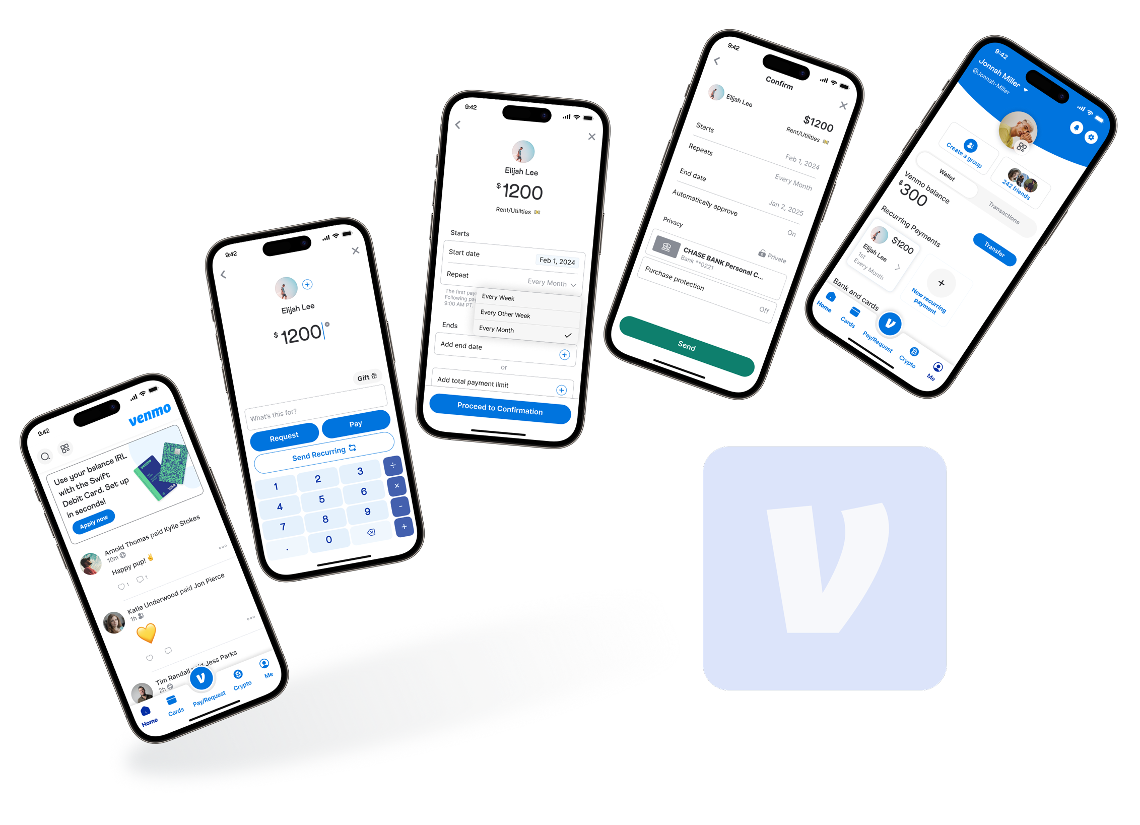
Venmo - Empowering Users with Recurring Payments
An automated solution for regular repeated payments using Venmo, a peer-to-peer payment app.
December 2023 - January 2024
In this 80 hour design challenge, I undertook a UX design project focused on enhancing Venmo, a leading peer-to-peer payment app, by introducing a recurring payment feature. This case study unfolds the narrative of research, design, and testing to address the unmet need for regular, automated payments within Venmo’s functionality.
Overview.
Venmo, known for its swift and enjoyable P2P transactions, found its stride in casual cost-splitting. However, diving into secondary research, I uncovered a broader landscape. Users weren't just sharing bills with friends; they were handling repeated household expenses, personal services, and more. The revelation: Venmo lacked a recurring payment feature to accommodate these evolving needs.
The Challenge
In the ever-evolving fintech industry, where trends and competition are driving forces, I saw an opening for Venmo to fortify its position and increase its transactional revenue. The goal was clear - research, empathize, strategize, and design a feature that seamlessly accommodates users' needs for regular, automated payments. This feature could naturally increase Venmo’s transaction rate and keep it’s hold on the market.
The Goal
User Research, UX/UI Design, Visual Design, Information Architecture, Prototyping, Usability Testing.
My Role
Solo project, 80 hour design challenge.
Team
Tools Used
Figma, Maze, Notion
Process.
Research
Information Architecture
Wireframe
Prototype
Test
Iterate
Research.
Before I got deep in any researching I needed to first understand more about Venmo, the fintech industry and, who our target user was. I started this with secondary research and provisional personas.
Ramp Up
Competitive Analysis
The competitive analysis unveiled the strengths and weaknesses of rivals like Cash App, Zelle, Apple Pay, and PayPal. Intriguing trends like BNPL and gamification stood out, but the spotlight turned on the scarcity of recurring payment features, a gap that Venmo could fill.
User Interviews & Surveys
Engaging in intimate conversations with users, I delved deep into their habits, uncovering a demand for recurring payments.
What are users personal habits on how they manage expenses and where do peer-to-peer payment services fit in?
How do users typically go about managing household bills? Do they split them with other household members? If so, what is their process for doing this?
Research questions asked:
High demand for recurring payments on Venmo.
Users commonly utilize Venmo for rent, utilities, subscriptions, and loans.
Interest in shared accounts for expenses but with concerns about security and trust.
Valuable insights included:
With data coming in from the interviews, I used it to craft my survey questions in order to determine if the insights from my interviews were represented of the larger market.
— User interview affinity map
Define.
Overwhelmed with research insights I needed to start planning and defining the parameters of this new feature.
Created a user persona (Sarah) based on research findings.
Developed a product roadmap and user flow, providing a clear path through the product for users.
Sarah, a 26-year-old marketing intern in Brooklyn, became the guiding light for design decisions.
The user flow I ended up with demonstrates the users path through the recurring payment feature, as well as, through ways to access and edit existing recurring payments.
The “Pay/Request” feature in Venmo is the most prominent and used aspect of the existing app. I decided this would make the most sense, as far as discoverability, to include the ‘recurring payment’ through this button and not a separate entry way. This puts Pay, Request, and Send Recurring Payment’ all under the same umbrella at similar hierarchical values and prevents the user from having to re-lean a new functionality.
— User flow
Design.
Wireframes
The wireframing phase resulted in many ideas, but the challenge laid in translating sketches into digital reality. High-fidelity wireframes underwent rigorous iterations, aligning with Venmo's established design guidelines.
Explored various low-fidelity wireframes and iterated based on feedback.
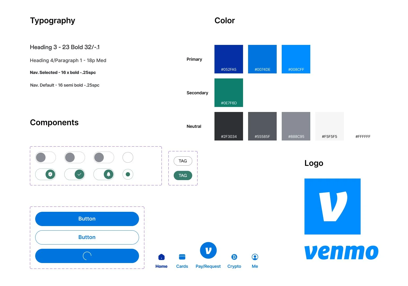
Aligned designs with Venmo's style guide, ensuring consistency with the established brand.
High fidelity wireframe design iterations - Request/Pay/Send Recurring Screen
Decisions made during wireframing referenced the product roadmap, user flow, persona, and research insights. I included features such as ‘end date’ and ‘total payment limit’ because of users interest in customization, trust, and being in control of their finances.
This also led to an option to ‘automatically approve’ or ‘ask my approval’ when payments are made. Users expressed they want a notification when recurring payments are being processed or want to be able to stop them easily if they need to.
Early high fidelity wireframe - set up recurring payment flow
One of the constraints for this project was staying aligned with Venmo’s established design guidelines. I was able find a Venmo design system ‘look alike’ through the Figma community, which gave me most of the assets I needed to create a Venmo look alike. There were some small adjustments on color and typography I needed to make.
Test.
Prototype
I made an interactive prototype, offering a glimpse into the user experience. Prototyping posed challenges, particularly in navigating the complexities of the recurring payment setup.
Usability Testing
I conducted usability testing, both remote and in person with 7 participants. For the test I used a tailored interactive prototype with realistic content in line with our persona (video above). From here I referred to the persona and user flow to establish a series of tasks.
From the home screen, set up a new recurring payment for ‘rent/utilities’ starting Feb 1st, repeating every month, and ending after a year.
Edit this existing recurring payment to increase the amount by $100 and extend the end date for another year
Create a new recurring payment for a loan payment and set it to end once it reaches a total payment limit
I analyzed the results by creating themes in an affinity map. I then organizing the insights from the themes on a frequency/severity matrix. This helped me solidify what changes to make in order to improve the product experience.
Findings & Iterations
1. “Edit” button redundancy. - Users wanted to directly click on elements to edit them from the details screen.
Take away the “edit” button on the preview card and replace it with a chevron icon, symbolizing “open this card”
Change “edit” button color on preview screen to a highlighted main blue color in order to increase visual hierarchy.
Solution:
Before Testing
After Iterations
2. Confusion with “end” section.
Solution:
Add an “or” between the two optional ‘end’ actions. This adds whitespace between elements, further indicates that these are optional additions, and invokes a one or the other in a more intuitive layout.
Before Testing
After Iterations
3. “Send Recurring Payment” button on payment details screen redundant.
Solution
Change the button so it says “Proceed to Confirmation”. This explicitly indicates the action and the following screen.
Before Testing
After Iterations
Final Designs
Here are some final iterations of designs for the recurring payment set up flow.
Reflection.
Next Steps For This Project
Develop a more fully functional prototype for more realistic testing scenarios.
Conduct in-person usability tests with more complex tasks to simulate real-world scenarios.
Challenges Faced
Initial uncertainty about the direction of shared accounts, requiring a shift in focus.
Iterations in high-fidelity wireframes demanded more time than anticipated.
Prototyping complexities, especially on the setup page.
What I Learned
Gained insights into the dynamic fintech industry, appreciating the use of modern technology to redefine traditional banking.
Reinforced the importance of research in guiding effective design solutions.
How This Project Can Inform My Future Work
Enhanced organization through centralized asset management on desktop and Notion.
Acknowledged the value of A/B testing for refining high-fidelity designs before usability testing.
What I Could Have Done Differently
A/B testing high-fidelity designs could have provided more insights into design choices.
Conclusion
This project transformed my perspective from a biased advocate for change to a user-centric designer. It underlined the critical role of research in shaping design solutions and challenged my prototyping capabilities. Moving forward, the experience gained will undoubtedly influence my approach to future projects in the dynamic field of fintech.


