TSTMKR - Stream DJ’s Sets
A responsive web app that connects listeners with quality DJ set mixes. A pro DJ’s flow, not a playlist.
April - July 2023
OVERVIEW
The Problem
Inspired by the importance of ‘vibey’ background music at a restaurant, coffee shop, or business. In many cases the music does not quite fit in or can be be choppy, without a natural energy and flow. How can we use technology to create a better solution?
The Solution
I designed an end-to-end web app along with it’s name, branding, and visual design, with users interest guiding my decision making. The result is a platform for DJ’s to make accounts and post their sets for listeners and businesses to discover and stream them.
My Role
User Research, UX/UI Design, Branding, Prototyping, Usability Testing
Tool Used
Figma, Maze, OptimalSort, Notion, Illustrator
Team
Solo student project
Process
Research
Conceptualize
Design
Test
Understand
When first prompted with this challenge I had to organize myself and understand exactly what the problem was and how the target user actually feels about it.
I was aware of the value a good DJ could provide, with unique musical taste and a professional flow. I was also aware of how ubiquitous streaming playlist were, from someones personal device to the music in the background of a businesses.
My challenge was to find a way to connect the two. My initial thoughts were based around streaming a live DJ. With this foundation I set out to conduct my research.
The Objective
Research, strategize, and design a responsive website in order to fill in the gap between streaming playlists and live in-person DJ’s
RESEARCH
Deep dive into the existing market
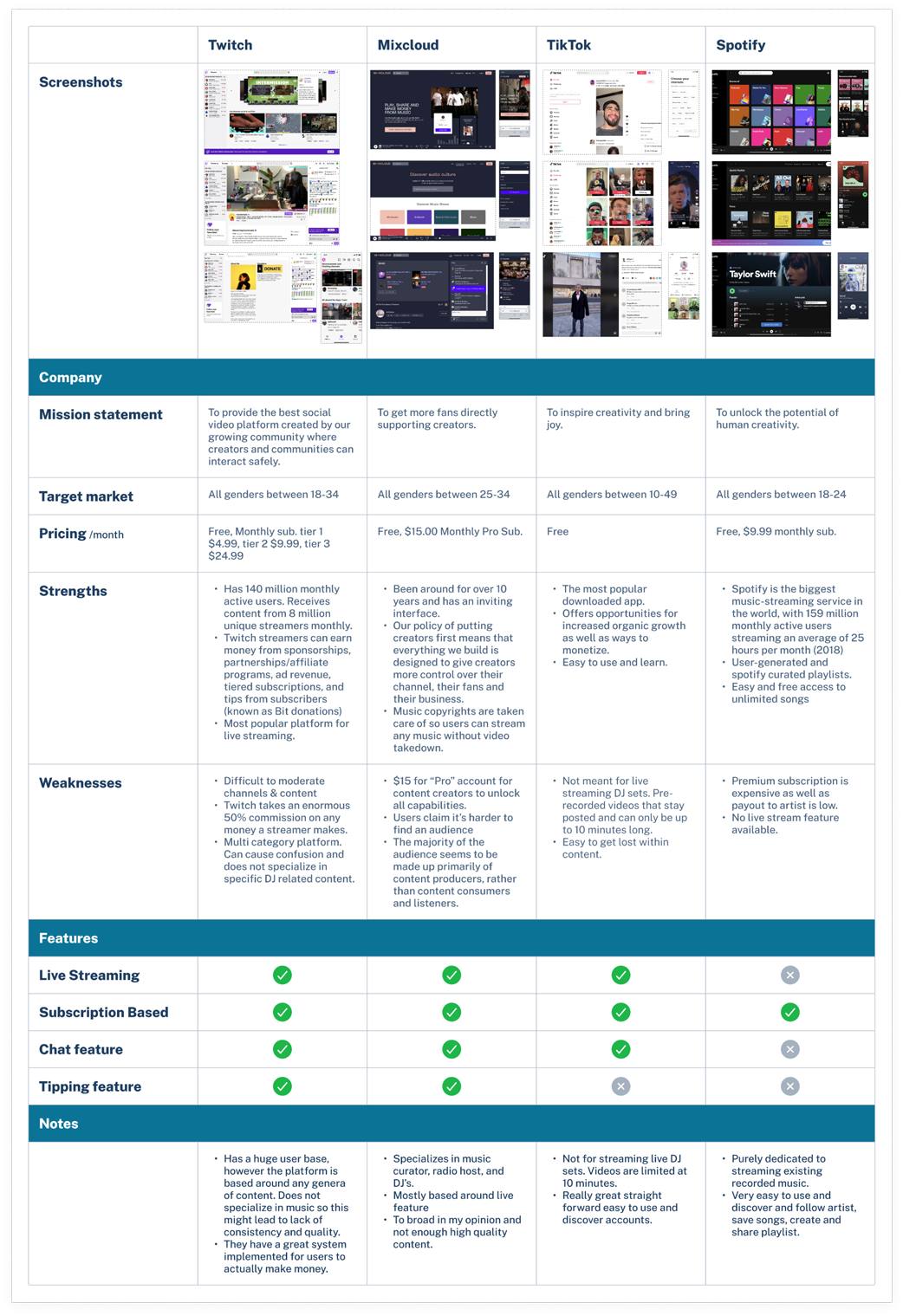
I started with an intense competitive analysis to gain a better understanding of what currently exists in the market and where to better position this product.
I further examined Twitch, MixCloud, TikTok, and Spotify.
These are some takeaways:
These services have a large hold of a market and are very in demand and established
It gets murky when it comes to live streaming, by either content overload or less hold on the market
Spotify dominates when it comes to streaming music but has no live stream or DJ feature.
— Competitive Analysis
User Interviews
These interviews proved to be the most influential part of every decision to come.
5 participants, in person and remote, moderated open ended questions.
I developed a research plan with objectives and goals that acted as the guide for conducting these interviews. The main focus here was to learn peoples habits around consuming music, along with their thoughts, feelings, pain points, wants, and needs.
This lead me to creating my next assets including an affinity map, personas, HMWs and POVs, and storyboards.
CONCEPTUALIZE
Data Synthesis
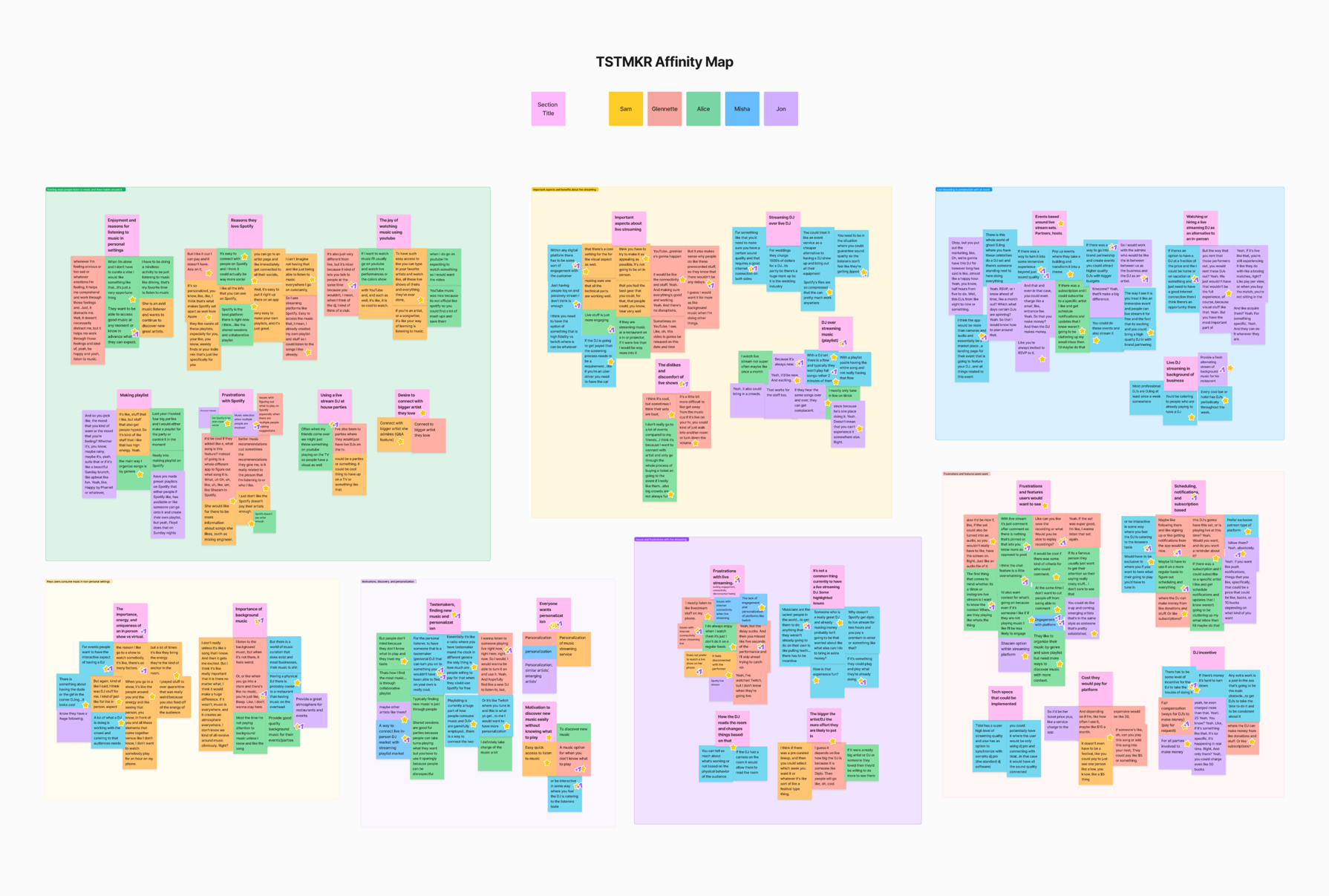
From my research findings, I first synthesized interview quotes and observations into an affinity map. This allowed me to determine patterns I could turn into valuable insights.
From here I was able to converge these insights, into user personas to facilitate in decision making.
Affinity map key takeaways:
Users love playlists and live because of energy, flow, and discovering new music
Not satisfied with live-streaming for reasons such as lack of engagement and connection issues
Users have a desire for discovering fresh new music that makes them feel something. They say it can also be difficult to find new music in general.
A huge takeaway after all this I discovered was:
Users overall lack of interest in an actual ‘live stream’. They expressed a lack of engagement, connection issues, and overall quality.
This is where I started to make a pivotal decision and move into a prerecorded DJ set system.
The Big Question
This is where the project and focus began to really shift. I created POV statements and used these to come up with HMW questions.
Narrowing in on specific areas of the problem and forming a question around them is what really helped me in understanding a more approachable point of view.
“How might we help businesses provide fresh, exciting, and quality background music?”
DESIGN
Building a Solution Into a Design
With insight and assets from previous steps guiding my decision making I moved forward with information architecture, card sorting, user and task flows, and lo-fi wireframes.
Key takeaways:
Determined site navigation
Accounted all screens and features needed through user/task flows
Establish effective layouts with lo-fi wireframes
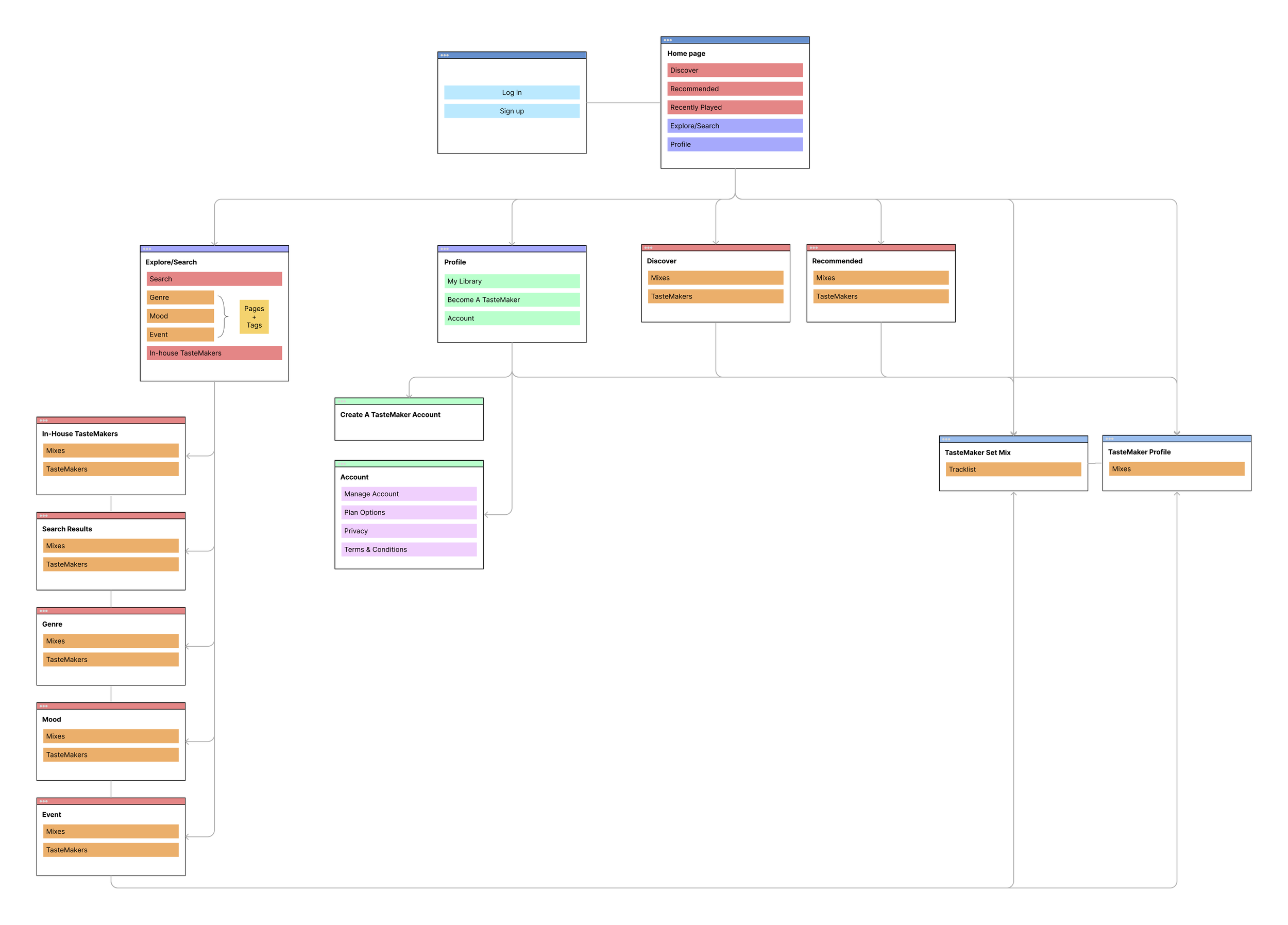
For the sitemap I decided to add some of the main features and sections that would be included on each page. This significantly helped me while designing wireframes.
— Sitemap
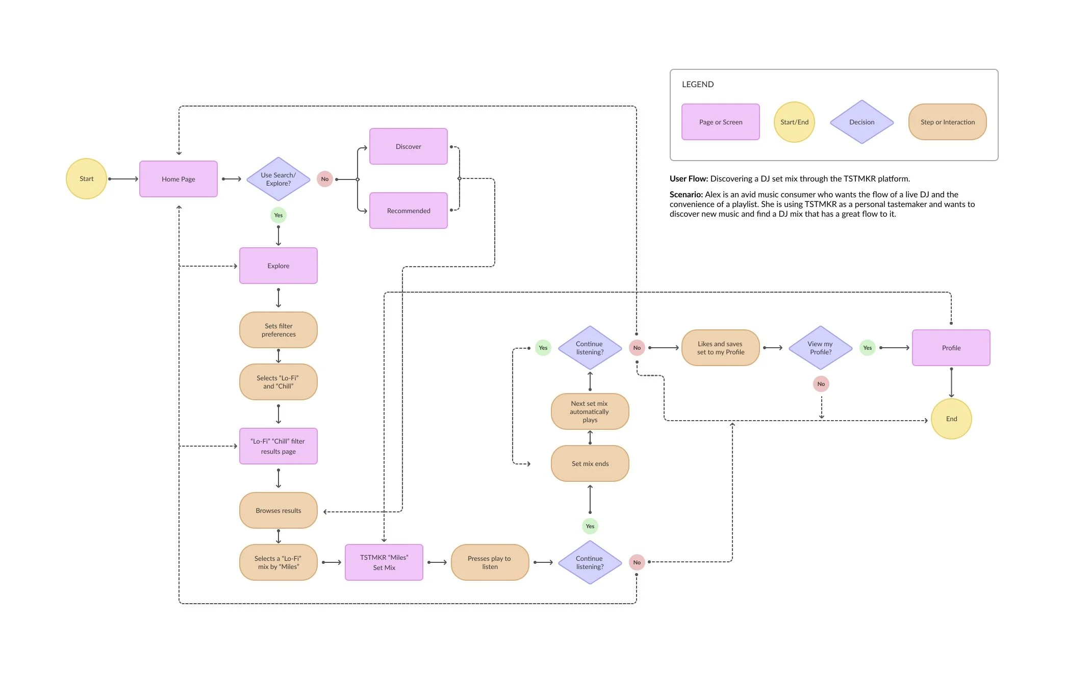
The sitemap in addition to the user personas laid as a foundation to create a detailed user flow. Having an established sitemap and user flow allowed me to stay within the scope and ensured I was designing the screens and features that were needed.
— User Flow
Finally, through an iterative process starting with sketches, the sitemap and user flow directly translated into low fidelity wireframes.
— Lo-fi wireframes
Branding
An important aspect to establish was the branding and visual design. I had to make sure this product was in line with it’s user base and that it’s brand spoke their language, visually and expressively. This was another opportunity to conduct competitive research, create a mood board, and refer back to my personas.
I established the name, came up with a brand promise, keywords, and voice.
I invested a lot of time in designing a logo. I felt this was important and that it had to visually speak the users language. I started with keywords and description words which led me into numerous sketch and design directions. I then polished up a few I believed were not only the best but also spoke the brand language.
The final is a simple icon-like symbol of a vinyl and a little star symbolizing tastefulness.
Brought character to the product in alignment with users
Determined logo, colors, and typeface
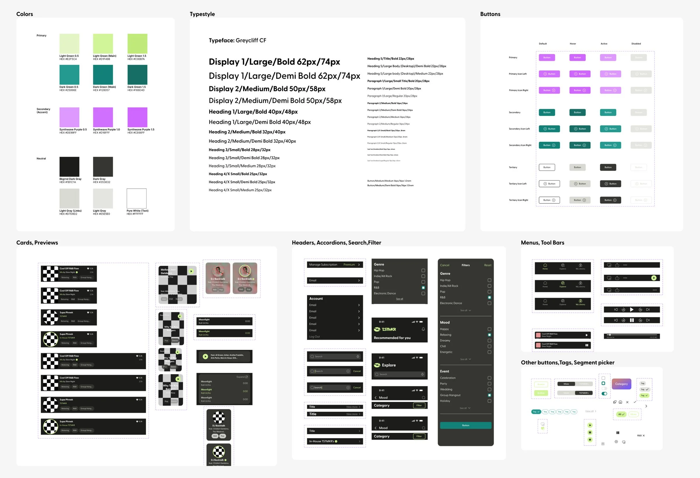
Developed a style guide and component library
— Style Guide / Component Library
Usability Testing and Iterations
Using the style guide, I moved into hi-fi wireframes, making adjustments and fine tuning before creating a prototype. The last thing I knew had to be done
In order to validate if the design solves the users problem and are enjoyable and easy to use I conducted a usability test.
I determined 3 specific tasks for these participants and evaluated success based on task completion, ease of use, time taken to complete task and overall, if they found the product useful.
Fine tuned flow, interactions and developed prototype
6 participants - moderated and unmoderated usability test
Analyzed feedback and made iterations
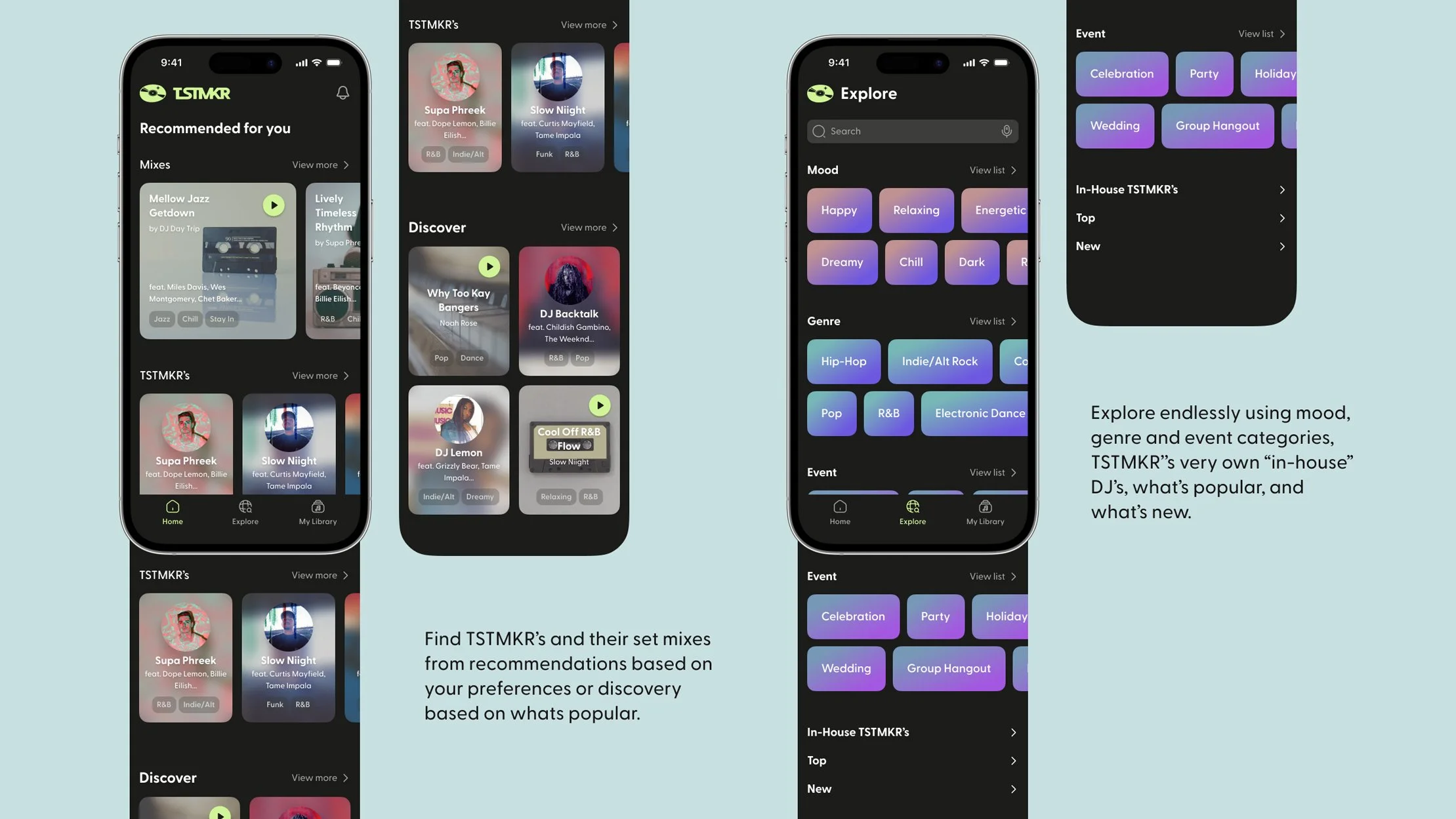
Homepage preview card title size increase: After receiving results and feedback from the usability test, there was one case where the user was not able to perform the task and advance to the specific TSTMKR profile page from the recommended preview cards on the home page. This was reason enough for me to put a little time into iterating, making the title just a bit more visible so it will be beneficial to all users and of little effort. I increased the title size from 16px to 18px.
1.
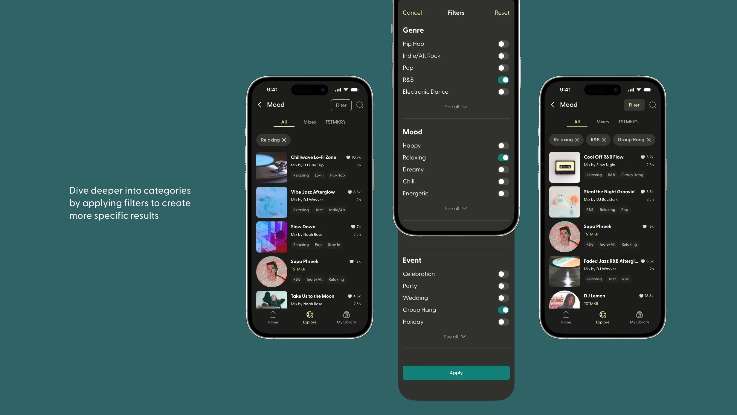
Category tags and buttons: Half of the participants expressed issues with the category tags resembling interactive buttons and the instinct to tap them. I set out to improve the ‘inactive’ aspect of the category tags. I first started by making them tighter around the text which makes the element smaller and suggest less interactive. I then made the corners less rounded from a pill button shape into more of a rectangle. Last I changed the background to be a little darker to blend in a bit more with the background and appear less interactive. In addition to this, I switched out the filter tag buttons form rectangle to pill shape to ensure they were different than the category tags.
2.
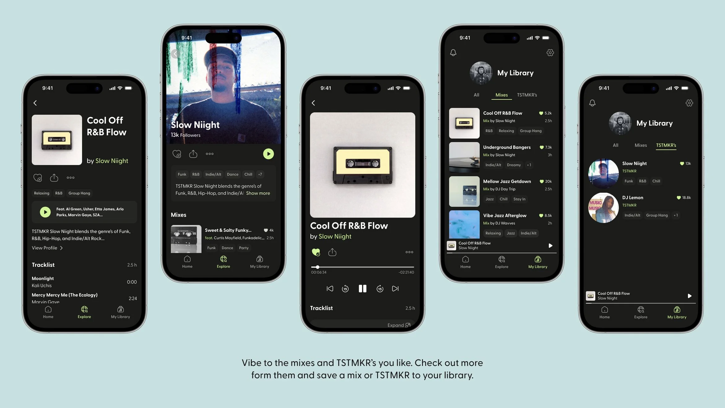
Further changes involving tags: As for the category tags at the top of the TSTMKR profile page, this seemed to be the area where most users would try and tap one of these as an interactive button. I decided to iterate on the elements here to reduce confusion. I took an approach similar to the design pattern in YouTube videos where the description is. I concealed the category tags and a shortened version of the DJ bio in a minimized card to group it together and separate the interactive aspect from the rest of the page.
3.
Tool icon size increase: There were a couple of cases where users missed the target when attempting to tap the save/heart icon. I concluded it was a little bit too small and therefore increased the size from 24x24px to 32x32px. This created no harmful impact to the design or visual hierarchy and increased the button target size by 8px so users could tap it more easily.
4.
THE RESULT
LEARNINGS AND TAKEAWAYS
Summary
Overall this was a lengthy and challenging project with ups and downs. I went into it with an idea in mind to create this mostly around a ‘live-streaming’ concept. After my research I was challenged with the findings that suggested users aren’t very interested in ‘live-streaming’ after all. This ended up being a good opportunity to utilize UX design assets and techniques to deliver a valuable solution.
Challenges
A big challenge and pivot was during interviewing when finding out users feelings about live streaming music. Learning this lead me to drastically question the whole project and overcome it with a better approach.
It’s important to be ready to challenge your biases and understand what is most important and how actual users feel.
This was a fictional, solo project I worked on while working another job on the side. I would have liked to have had a more consistent schedule with this in order to prevent breaking my flow. This was difficult to manage. Additionally I would have loved to have worked with a team to share ideas and resources to potentially build this into something greater.
Next
With the time constraints I had on this project and it being a solo job, I was only able to design the core flow of the product. I would love to see this product potentially come to life one day or at least design it into a full end to end experience with an on-boarding flow and more functionality.
With the importance shifting when I discovered how users aren’t very interested in live-streaming I changed the concept to pre-recorded sets. The DJ’s would be required to use Serato DJ software integrated with Tidal for music selection and licensing purposes. From here they can record a set and upload a .wav file.
Additionally, I would still like to add a “live” feature integrated in the DJ’s profile page. To take into account the users insights, it would be best if this “live” stream were only audio and require use of Serato DJ software in order to ensure quality. I also feel it would be important to add contextual information so listeners know what they are getting into.
Overall this has been an incredible experience allowing me to learn and takeaway so much, ultimately coming out as a much better designer.


