Casa Makai - Vacation Rental
Enhancing Casa Makai's vacation rental bookings by providing travelers with a more guided responsive web experience.
September - November 2023
Casa Makai is a 2 bedroom, 1 bathroom vacation rental home in Playa Maderas, Nicaragua. The property had just completed construction and needed a responsive website that could distinguish them amongst others, provide current and future guests with a source of information, and overall enhance the travelers experience.
Overview.
The Challenge
This project had very little existing foundation to start from. A lot of the details and content were not yet established such as branding, style guide, nightly cost, booking process, etc. The client requested for a responsive website for the vacation rental.
During research I discovered travelers preferred vacation rentals, however, they were frustrated with justifying prices, cleanliness, dealing with host, and overall transparency. I set out to solve these issues with Casa Makai.
The Goal
Improve the entire experience of traveling, booking, and staying at Casa Makai, by providing travelers with an intuitive guide to all their questions.
My Role
User Research, UX/UI Design, Branding, Visual Design, Prototyping, Usability Testing, Communication with Stakeholders
Tool Used
Figma, Maze, Notion
Team
Solo product designer working with business owner.
Process.
Research
Information Architecture
Wireframing
Design/Branding
Prototyping
Usability Testing
Iterations
Competitive Analysis.
Identify Users and Market
Before I got deep in any analysis I needed to first understand who our users were and the market we were in. I started this with secondary research and provisional personas.
Competitive Analysis
I spent time on an overall scan of secondary research then narrowed my competitors down to Airbnb, Hotel June, TripAdvisor, and Vrbo.
I analyzed them using a SWOT method and discovered;
Vacation rentals are a very big and growing market
Most websites for booking are’t super informative about the area
Small private vacation rentals often don’t have informative websites
— Competitive Analysis
User Interviews.
I conducted interviews with 3 participants via remote video call. These were extremely helpful in learning more about our users pain points, wants, and needs. Some critical research questions were:
What are peoples views and motivations towards traveling?
What kinds of frustrations do travelers commonly encounter when staying at a vacation rental?
What aspects about staying in a vacation rental are important to travelers?
How do people typically go about booking a place to stay when they are wanting to travel somewhere?
What are some things travelers wish were easier to find when planning activities?
What are some aspects that are important to travelers about the area where their vacation rental is located?
Initial Takeaways
Participants expressed a lot of interest in Airbnb in general
Motivations to travel were to get away from city life and gain perspective
Social media was a leading resource for discovering what to do and where to stay
Key Research Insights.
Most travelers prefer private vacation rentals over hotels. Reasons for this are privacy, kitchen and outdoor space, the unique experience, and being more a part of the local community.
Main frustrations travelers have are price, cleanliness, and dealing with the host. They want to be sure that they are getting a good value for their money, that the rental is clean and well-maintained, and that the host is responsive and helpful.
Travelers are interested in activities such as museums, walks/hiking, restaurants, cafes, coffee shops, cool shops, grocery stores/markets, pool, and art instillations. They also want to relax and enjoy the scenery and nature, and they appreciate unique features of the rental.
Travelers want the vacation rental website to have a lot of photos and videos, information about the rental's unique features, and recommendations for activities and restaurants in the area.
Travelers most often use social media then Google, Yelp and other online resources for discovering activities and restaurants. However, they are mostly unhappy with these resources and express it can be difficult.
I determined that what users liked about finding recommendations through social media was the fact they could connect the recommendation to a person with interests that might align with their own. An approach to this was to create a HMW question to focus in on this throughout the project.
“How might we give Casa Makai's site an identity that aligns with its target market's ethos?”
— Interview Findings Affinity Map
Define.
I took an iterative approach when synthesizing research findings, creating living assets that would evolve as the project unfolds.
Deliverables created:
Affinity Map
User Persona
Feature Priority List
Sitemap
Our final persona was named Cristo – a hard working business owner who takes occasional breaks to travel. He mostly enjoys getting out of the city to more remote areas where he can relax and gain perspective.
— User Persona
Information Architecture
Our sitemap takes inspiration from competitors and other similar markets. This should help in being familiar to users. We’re using a flat navigation with 6 main pages.
— First Iteration Sitemap
The original sitemap was more ambitious with a section dedicated to amenities and another for a ‘travelers notebook’. We decided for an MVP to cut this idea for the time being and come back to it down the line.
— Final Iteration Sitemap
Wireframes.
Wireframes helped me with thinking about the layout of the product and help me to fine-tune all the features.
I started with sketching on paper, which allowed me to express the ideas quickly and then continued with low-fidelity wireframes in Figma.
— Low-fi Wireframes
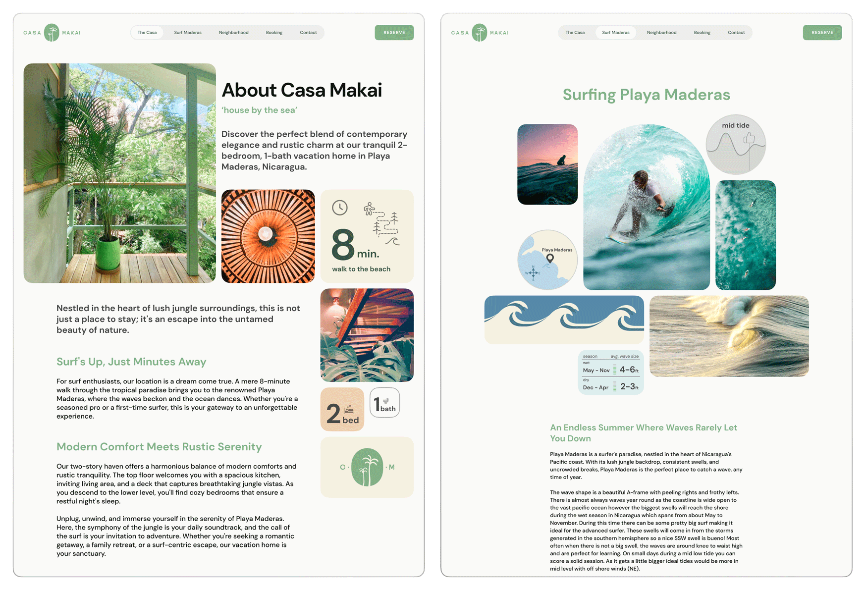
Translating the designs through low fidelity into high fidelity proved difficult at points. The ‘About’ page included a lot of information that required some re-designing to portray the all the content and keep it in line with the Casa Makai branding that I later established.
I chose to break away from the basic ‘centered’ approach so users can have a better understanding of the uniqueness and character of Casa Makai. This also allowed me to fit more content in a smaller area while maintaining visual hierarchy. I was also able to spotlight some important information users look for such as ‘8 min. walk to the beach’ and ‘2 bed, 1 bath’.
Iterations of the ‘About’ page
Branding.
I set out to establish a strong brand identity for Casa Makai in line with the HMW question established after research insights.
“How might we give Casa Makai's site an identity that aligns with its target market's ethos?”
There was no existing style guide, logo, or any brand assets so I was starting from scratch with some characteristics given to my by the client. From here I created a mood board with graphic design elements, UI design, flyers, colors and typefaces.
Characteristics: Contemporary minimalistic, surf/beach, Hawaiian meets tropical Spanish villa.
— Mood Board
I created a logo using characteristic words and branching out from there, referring to my mood board, and browsing competitors approach. From here I moved forward with several sketches and digital variations. After some back and forth with the client we landed on a simple oval ‘mirror’ shape with a silhouette of two palm trees. A familiar look associated with hospitality and tropical landscape.
Established typeface using DM Sans and setting styles. DM Sans has a great readability and is just the right amount of both friendly and professional.
After an iterative approach we decided on a sort of pastel green primary, terracotta accent, and off white/cream neutrals for a color palette.
I established some UI elements and created a style guide.
Design.
I implemented the established style guide into the designs with some real and filler content.
I ran into some trouble here in making decisions about content. The client did not have the ideal content available, which lead to me conducting extensive research and in order to fill the website with the information needed for users such as advise and recommendations about the area. In future projects I’d like to settle this at the start to prevent any delays.
— First iteration, “The Casa” screen (left)
— First iteration, “Surf Maderas” screen (right)
I created hand-drawn maps of the area to use in alignment with the style guide. This was really fun!
— Hand-drawn map of Playa Maderas area
Prototype.
To validate my designs I created an interactive prototype in Figma.
I wanted to make sure this would work as similar to the actual website as possible, so test participants could give helpful feedback and not get stumped by functionality.
Usability Testing.
I conducted a usability test to determine weather this product was easy to use, useful, and enjoyable. I wanted to specifically test if users could find information they are looking for easily.
Task based
Unmoderated, remote test
Implemented using Maze
5 participants
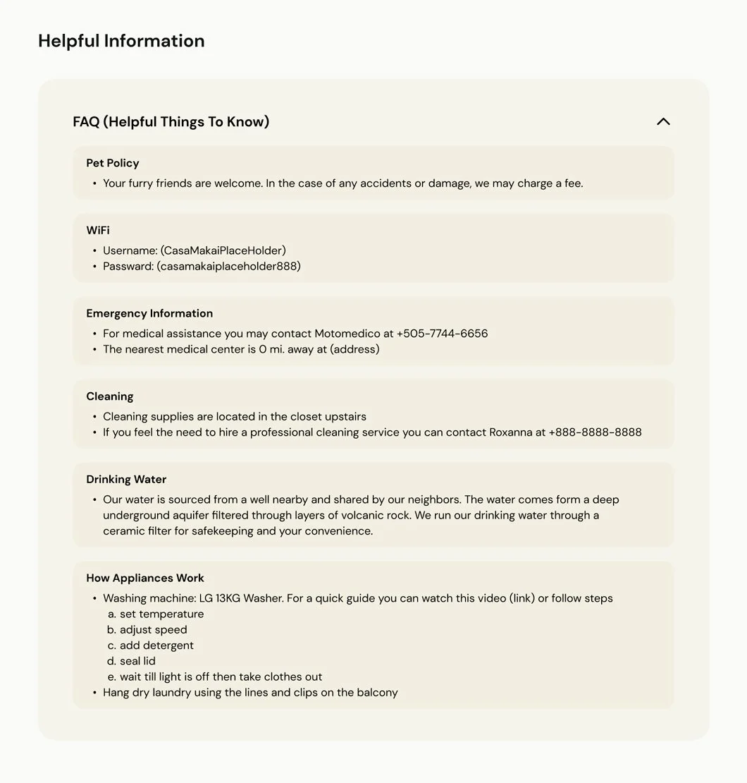
Finding WiFi information
Discovering food + drink recommendations in the area
Determining if the vacation rental meets your requirements of a private, 2 bedroom, full kitchen vacation rental
Tasks involved:
I organized my usability test findings using a four quadrant matrix (Worked, Change, Questions, Ideas). From here I created an affinity map then placed the themes I discovered in a severity/frequency matrix in order to determine what I needed to iterate on.
Severity/frequency matrix
Findings.
Iterations.
1.
Before Usability Testing
After Usability Testing
Weren’t able to find wifi information 2/5
Or expected to find it under FAQ 3/5
Issues with finding wifi information
Consolidated the “Tech & Appliances” dropdown with the “FAQ” dropdown into one under the name FAQ. This addresses both issues making wifi easier to find and nesting it under FAQ.
Solution:
2.
Before Usability Testing
After Usability Testing
Some trouble finding ‘Food + Drink’ recommendations 2/5
Section about surfing should be lower on the page 1/5
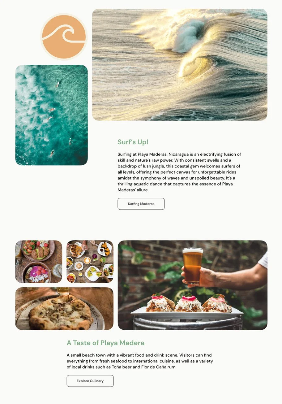
Only 2 participants had a little trouble finding ‘Food + Drink’ recommendations and one of them still found the section. However, with the addition of feedback suggesting to move the “Surf Maderas” section under “Neighborhood” down and “Explore Culinary” up was enough for me to make the change and make this overall quicker to find for users as there is a whole page and navigation tab for “Surf Maderas” already.
Solution:
3.
Before Usability Testing
After Usability Testing
Issues with image gallery placement - it could be more upfront, not behind another button 2/5
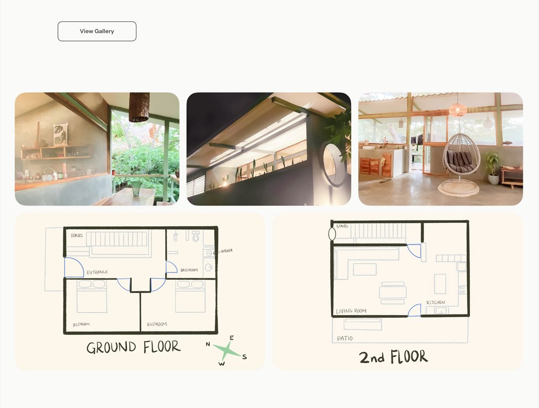
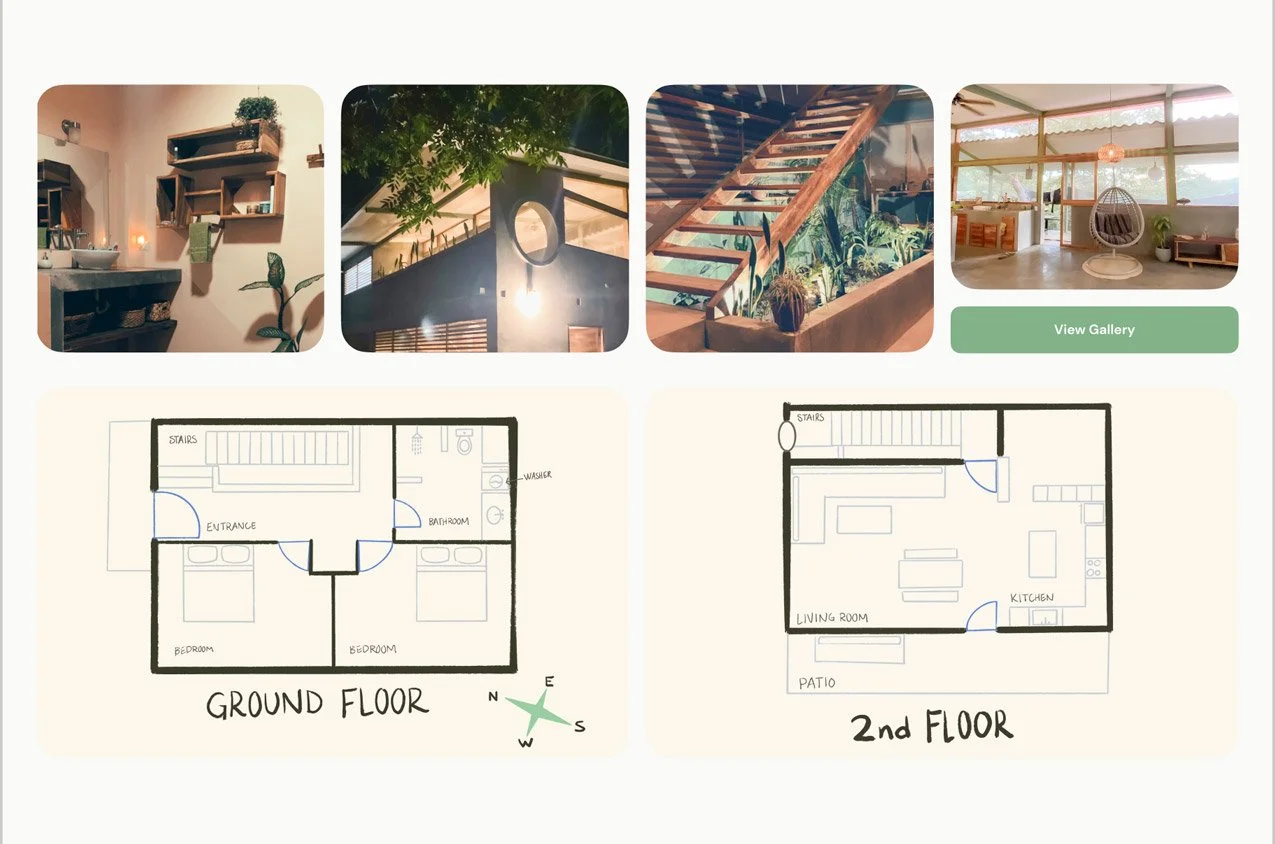
Enhanced the section dedicated to “view gallery”. I added another photo to the preview section making it four which shows the user a bit more before having to navigate to a new page. I also incorporated the button to be more cohesive and eye-catching so users can navigate there more easily.
Solution:
4.
Before Usability Testing
After Usability Testing
Wanting to find rental details under ‘booking’ 1/5
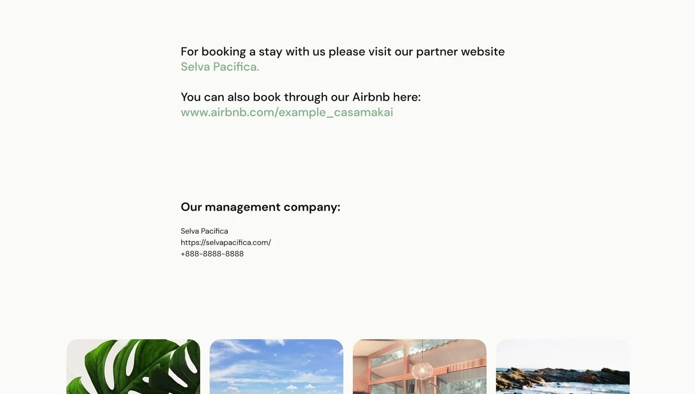
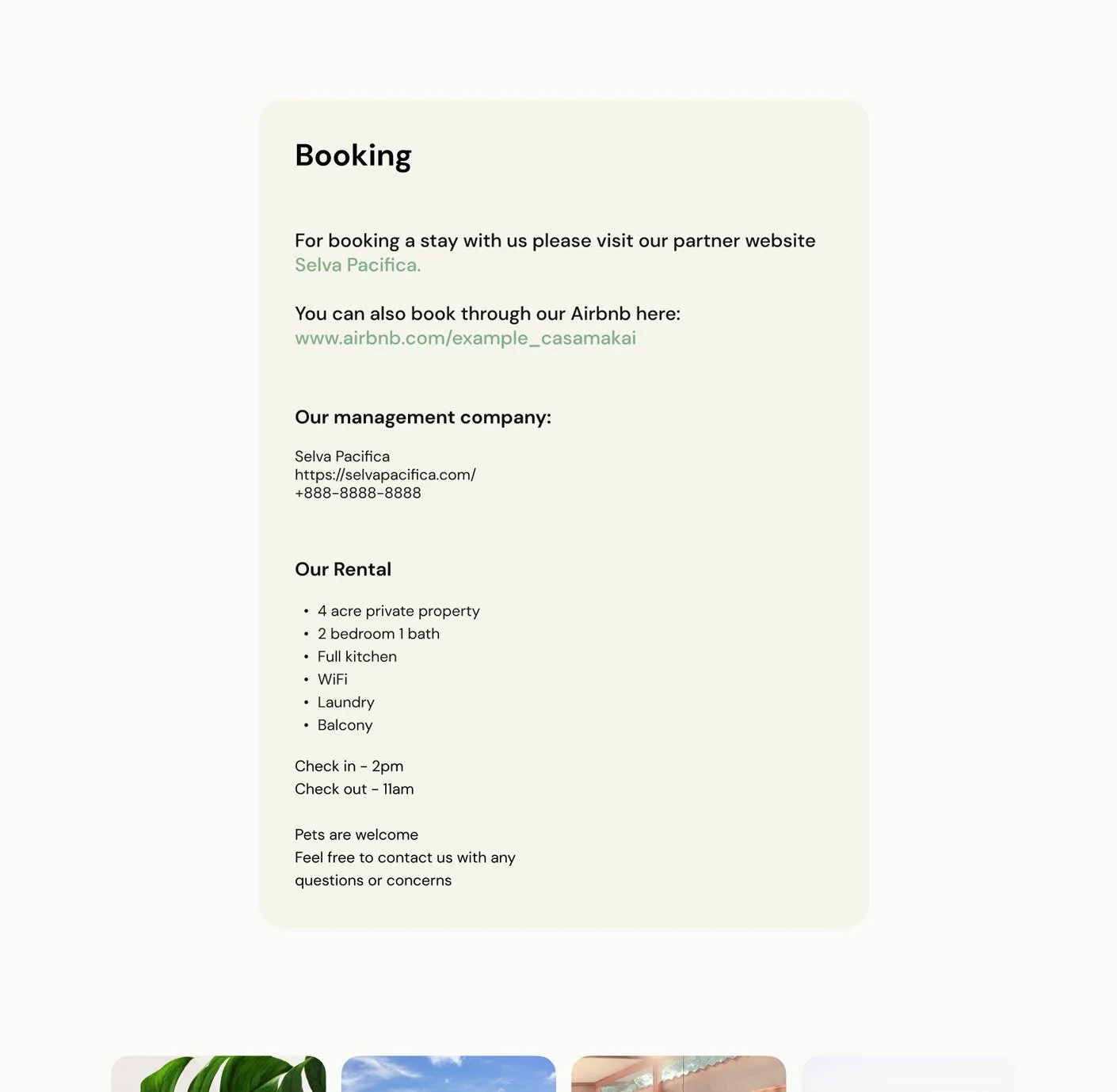
Wanting to find rental details under ‘booking’ ⅕ - Though this was feedback from only one participant, I thought it could be helpful with no harm done so I added some important details about the rental on the “booking” page
Solution:
Final Designs.
Next Steps For This Project
Currently we have our final first version of the designs baked into an interactive prototype. Next steps will be to develop and launch the website. For this I will most likely be doing this solo as well using Webflow.
I would like to conduct some surveys while the site is live and perform an audit after a few months. At that point I will make some iterations as needed to improve the site. Eventually I would like to implement a ‘Travelers Journal’ section and build the website so users can book directly though it.
Reflection.
Overall Project Reflection
Initially I was expecting to center the website around booking the vacation rental. Giving guest an option to choose dates and book directly though the website, provide essential information and photos. After speaking with the client I discovered they did not want a booking feature at the time, and instead, wanted a website to highlight the vacation rental and the area, with a link to the property manager for booking.
After conducting research and interviewing travelers, I discovered what they really wanted and most of the time a simple booking website wasn’t it.
They were looking for:
more transparency
A unique experience
Essentially an information guide
This is where the project took a shift and what determined the solution. Users wanted transparency, an experience, important information, and recommendations they could trust. Our solution was to provide as much helpful informations as possible while maintaining a digestible and easy to use website.
Challenges I Faced
A main challenge was that this project had very little existing foundation to start from. A lot of the details and content were not yet established such as nightly cost, check in/out times, check in/out process, etc. The client had just gotten though an intense 2 years of the construction project so they were taking a small step back from anything related to Casa Makai. This lead to difficulty in communication and delays on assets, feedback, and approvals.
What I Learned
Under the time constraint and it being a solo project I had to really evaluate the scope of the website and features and make some hard cuts in order to deliver a minimum viable product in time. This was executed when it came to creating a feature priority list and determining how many screens or sections would need to be designed. I started with 8 screens with sub sections and features and cut it down to 6 main navigational screens with 6 sub sections.
I also refined my UI design skill specifically in designing responsive sections. The challenge is to think about how to utilize containers, spacing, and stacking in order to achieve a pleasing cohesive design through each breakpoint.
What I Could Have Done Differently
There was a point in the project after the main research phase and at the start of designing when I was doing more secondary and competitive research. During this I discovered many more similar vacation home rentals and boutique hotels in the area that were similar to Casa Makai. This would have been very helpful to discover early on while I was doing my initial competitive analysis. I think it would have primarily saved time and might have provided me with a slightly different approach going into user interviews.


